10 Website Mistakes That Are Costing You Clients (And How to Fix Them Today)
It’s not your offer. It’s not your vibe.
It might just be your website — but don’t worry, we’re about to fix that.
Let’s talk about the silent sabotage that’s probably happening on your site right now.
No shade — just real talk.
You’ve got a killer service.
You’re showing up.
You know your work changes lives…
So why isn’t your website bringing in those dreamy “YES” clients on autopilot?
Here’s the deal: most websites unintentionally confuse, overwhelm, or hide your magic.
So let’s break down the biggest (and most common) website mistakes — and how to lovingly flip them into conversion gold 💛

Mistake 1: Hiding Behind Vague Words
Saying “I help people transform” is… sweet. But it’s also confusing.
Here’s how to fix it:
Say what you actually do, in the way your ideal client actually thinks.
“I help new coaches go from idea to booked out — with a website they love and a strategy that feels good.”
Mistake 2: No Clear Call to Action
If your site doesn’t tell people what to do next, they’ll do… nothing.
Here’s how to fix it:
Every page should whisper (or scream, lovingly):
“Here’s your next step.”
→ Book the call
→ Grab the freebie
→ Shop the template
Mistake 3: Designing for Aesthetics, Not Conversions
Yes, we love pretty — but if your dreamy colors and fonts don’t lead people somewhere, they’re just… decoration.
Here’s how to fix it:
Use hierarchy, flow, and layout to guide the eye. Your website should feel like a warm conversation, not a maze.

Mistake 4: Talking Like a Corporation
You’re not a team of 12 (and that’s a flex). So why does your site say “we provide solutions”?
Here’s how to fix it:
Drop the corporate mask. Write like a human. A confident, clear, chill expert human.
“Hey, I’m Ana — I help creative women launch sites they’re proud of. Let’s make yours effortless + beautiful.”
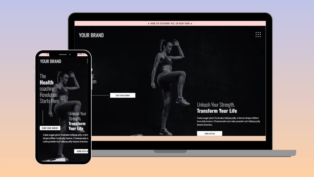
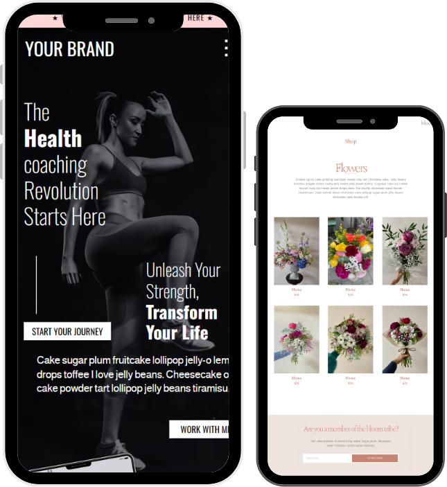
Mistake 5: Ignoring Mobile Design
More than 60% of people will view your site from their phone — and if it’s clunky, they bounce.
Here’s how to fix it:
Use Showit’s mobile view (it’s easy, I swear). Tweak your spacing, text sizes, and buttons so it feels as good on your phone as it does on your laptop.
Mistake 6: Overloading the Homepage
Too many offers, too many words, too many vibes = confusion. And confused people don’t click.
Here’s how to fix it:
Focus your homepage like an invitation:
💌 Who it’s for
💌 What you do
💌 How to take action
That’s it.
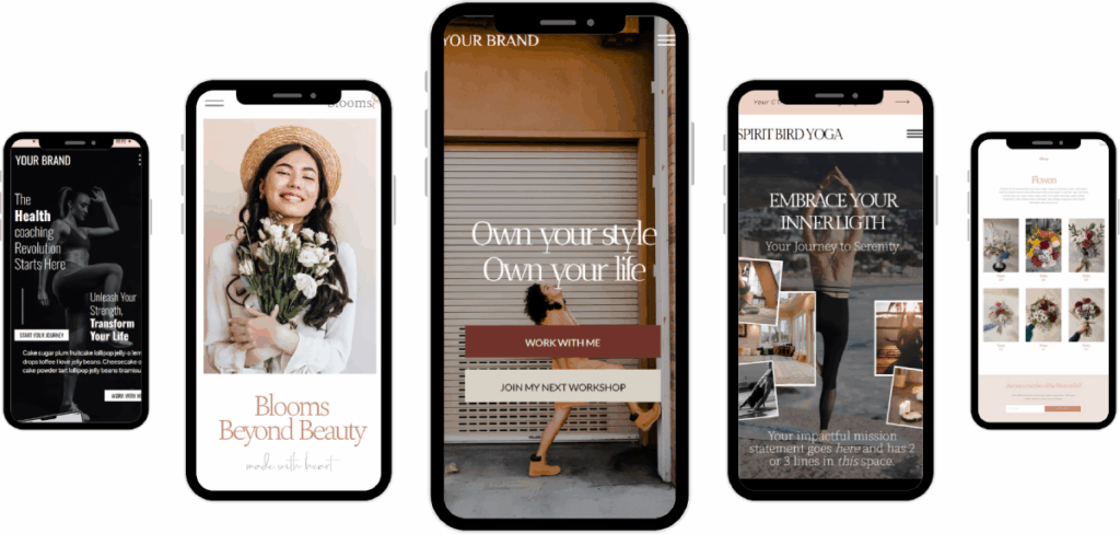
Mistake 7: No Brand Personality
If your site could belong to anyone… it’s not doing you justice.
Here’s how to fix it:
Let your quirks, voice, colors, and energy shine through. Add a GIF. Say something weird. Be you.
People don’t buy generic. They buy connection.
Mistake 8: Zero SEO Strategy
If Google doesn’t know what your site’s about, it won’t show it — no matter how pretty it is.
Here’s how to fix it:
Use clear headlines, alt text, page titles, and smart keywords.
(Need help? DREAMxGo templates are designed with SEO-friendly structure already built in ✨)
Mistake 9: No Free Value
If people have to “work” to understand your magic, they’ll leave.
Here’s how to fix it:
Offer a freebie. A podcast section. A checklist.
✨ Build trust before the transaction.
Psst… you can grab my Free Showit Podcast Section if you want a done-for-you way to start.
Mistake 10: Waiting Until It’s Perfect
The biggest mistake? Not launching because you’re still tweaking fonts and obsessing over button colors.
Here’s how to fix it:
Launch messy. Adjust later. Let people meet you where you are now.
Your dream clients aren’t looking for perfect. They’re looking for you.
Ready to Fix These Today (Without Starting From Scratch)?
Explore my collection of DREAMxGo templates — they’re designed to feel good, convert softly, and get you out of website limbo.
Clarity, strategy, and beauty — without the overwhelm.
July 19, 2025
Share
Ana Garcia Simon
")
")
")
")
")
")
")

")
")


")

")


Be The First One To COmment
Comments